Panel config files
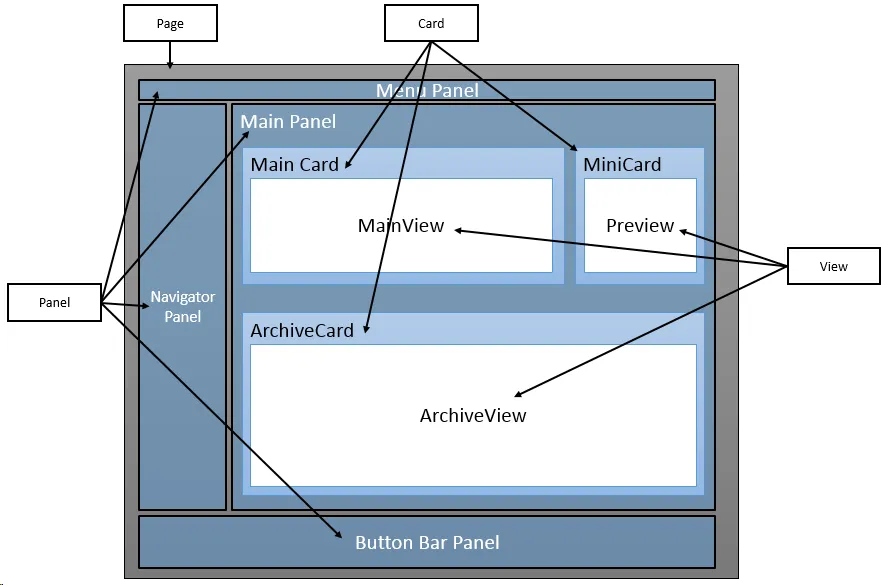
Corresponding to the same diagram as we looked at discussing the components of a page, a panel config file contains config data on the other elements of the page.
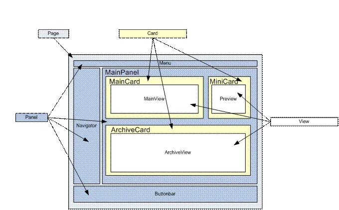
- Inside a panel, there can be many cards
- Inside a card, there can be views
- Inside a view, there can be many controls (Which are not shown in the diagram)
Thus, a panel configuration file defines the UI structure of a panel and contains the layout of Cards in the panel, which in turn contain views and controls.
Panels represent the main containers of a page (the outer UI frame) and are the first elements to support positioning attributes.
Each main entity page has 4 panels that define the upper menus, left navigator buttons, entity details, and lower action buttons.
<!-- SoExamplePanel.config -->
<panel id="PanelContainerFile" type="PanelType"
       soprotocol="PanelContainerFile" paneltype="Main">
  <caption>Panel Caption</caption>
  <cards>
  <!-- Cards contain views -->
  </cards>
  <config>
  <!-- config values loaded during initialization -->
  <!-- child element are type specific,
       different panel types require
       different configuration settings.
       example below: panes and splitter-boundaries
       are specific where panel type="SplitterPanel"
        -->
    <panes />
    <splitter-boundaries />
  </config>
</panel>SoContactPanel
Below is an excerpt of the SoContactPanel.config file. We have cut out some parts to keep it reasonably short.
[!code-xmlXML]
The essential structure of the panel configuration looks like this:
[!code-xmlXML]
The outer element in this config file is panel. All the other config data is inside this element and makes up the config for the panel.
cards element
The second level here is the cards element, which holds the config data for all the cards in the config. That means a panel can hold many cards and the config data for those cards are grouped by the cards element.
-
The
placeholderidis a reference to a region of a page – where the content of this section should be placed. These names are defined on the master page. -
The
typeandcardtypeindicate which rendering interface should be used. These are defined in the SoObjectMapping.config file.
card element
The next level of the config file is the card element. The config data for the card can appear in 2 ways inside the cards element. If it is referenced, there will be a separate config file for the card.
Option 1:
[!code-xmlXML]
Option 2:
[!code-xmlXML]
The cards can contain any number of views, which are laid out according to the definition on the card and the properties of the control.
Different panel types
| Name | Description |
|---|---|
| MainPanel | Most simple panel without any special capabilities. A blank canvas. |
| SoDialogPanel | Base panel for all dialogs. In edit mode by default. |
| SplitterPanel | Base panel for all main pages that displays classic SuperOffice splitter panel (see image above). Can be used without splitter capability, as seen when viewing the browser panel page by clicking the SuperOffice logo. |
Recommended types for main panels
| Element type | Type attribute |
|---|---|
| Panel | SplitterPanel |
| Card | SoTabbedCard |
| View | SoView |
| ControlGroup | SoControlGroup |
Recommended types for simple dialogs
| Element type | Type attribute |
|---|---|
| Panel | SoDialogPanel |
| Card | SoDialogSimpleCard |
| View (main) | SoDialogSimpleView |
| - ControlGroup | SoControlGroup |
| View (footer) | SoDialogSimpleFooterView |
| - ControlGroup (footer) | OkCancelButtonBar |
Recommended types for normal dialogs
| Element type | Type attribute |
|---|---|
| Panel | SoDialogPanel |
| Card | SoDialogCard |
| View (header) | SoDialogHeaderView |
| View (main) | SoDialogView |
| - ControlGroup | SoControlGroup |
| View (footer) | SoPlainView |
| - ControlGroup (footer) | OkCancelButtonBar |